
View Poll Results: Harley Banner Opinion Poll
Design 1 left to right


5
7.46%
Design 2 left to right


21
31.34%
Design 3 left to right


7
10.45%
Design 4 left to right


30
44.78%
Design 5 left to right


4
5.97%
Voters: 67. You may not vote on this poll
Harley Banner Opinion Poll

#12
 11-04-2014, 01:49 PM
That helps but still doesn't look right.
Just make a longer rectangle and surround the lettering.
#15
11-04-2014, 10:12 PM
Club Member
#16
11-05-2014, 09:42 AM

Yeah, that looks better. We all know what the Chevron is supposed to look like, the subconscious takes over and fills it in while leaving the letters consistently readable.
#17
11-05-2014, 03:14 PM
hoethree--your question made my wife and kids laugh hard as I've been driving them crazy with my quest to get the banner just right.
If you have something you like better, post a pic and I'll consider yours instead...
If you have something you like better, post a pic and I'll consider yours instead...
#18
11-05-2014, 03:26 PM
Seasoned HDF Member
#19
11-05-2014, 06:29 PM

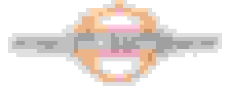
Update 1

Update 2
All the constructive criticism and votes have gotten me to these two final drafts. Looks like I'll be deciding between these two.
Comments on these two are welcome.
#20
11-05-2014, 06:40 PM
Advanced
Join Date: Nov 2013
Location: St. Louis, MO
Posts: 75
Likes: 0
Received 0 Likes
on
0 Posts
I voted for 5. I like the "reflection" on 1 & 5. As others have said, I do think it would look better if you enlarged the bar to fully encompass the lettering though.

Thread
Thread Starter
Forum
Replies
Last Post