


Lrs - new website
Tourer
Joined: Jan 2010
Posts: 485
Likes: 2
From: Colorado
This....similar to Harley Goodies. And maybe once per month, or once per quarter, you could have a windshield give-away contest. Not that I would ever win. 
I also agree with the pg.2 comment about showing pics of all the different height shields installed on the same bike. You competitor (WV) does this, which is very helpful to a buyer.
You could also mention how much taller/shorter the specific height LRS shield is than the factory stock HD shield. Road Glides would require two notations, as the stock shields are different for the Custom and the Ultra.
Finally, when you release the taller Road Glide shields, maybe you should offer some in-between sizes (e.g. 11", 13") rather than just 10", 12", 14", etc. I say this because that height is the sweet spot for average height male riders (5'9" - 6'2"). Most riders wanting talller shields for cooler weather riding want to look over the shield, and Harley has a habit is changing things. For instance, I hear the 2011 Road Glide has a 1" higher faring and 3/4" lower seat than the 2010 model. Therefore a perfect height shield for a 2011 would not be perfect for a 2010.
Thank you for the feedback... We are working on improving the website even more to benefit the buyer.
__________________

General Inquiries:
Info@LongRideShields.com
Sales and Marketing:
Sales@LongRideShields.com
Phone:
775.331.3789
General Inquiries:
Info@LongRideShields.com
Sales and Marketing:
Sales@LongRideShields.com
Phone:
775.331.3789
Road Captain
Joined: Nov 2009
Posts: 531
Likes: 0
From: Huntington Beach
Pretty good job. (I am a professional designer so my comments are not based on whether I think it is pretty or not.) Good web design is much more complicated than most perceive.
The main goal of a website design is to promote the content. Design the content, not the page. Users should be please by the design but drawn to the content.
Other goals are:
- A mood and tone that promotes the brand
- Pages are scannable so a visitor can quickly gather the nature of the content
- There is a clear pathway to desired information
One recommendation I have is on the home page you need a focal point and then more organization. I am currently working on a new site for CycleVisions. You can see it in production (not completely functioning yet) here: http://67.222.18.91/~cycle/. Notice an initial focal point and then how the content is organized. Here is another one we recently did: http://flukenow.com/. Same sort of idea of focal point and organization.
Road Master
Joined: Aug 2008
Posts: 927
Likes: 1
From: Indiana
HD Forum Stories
The Best of Harley-Davidson for Lifelong Riders
7 Surprising Harley-Davidson Products that Are Not Motorcycles
Verdad Gallardo
8 Best Harley-Davidson Motorcycles Ever
Pouria Savadkouei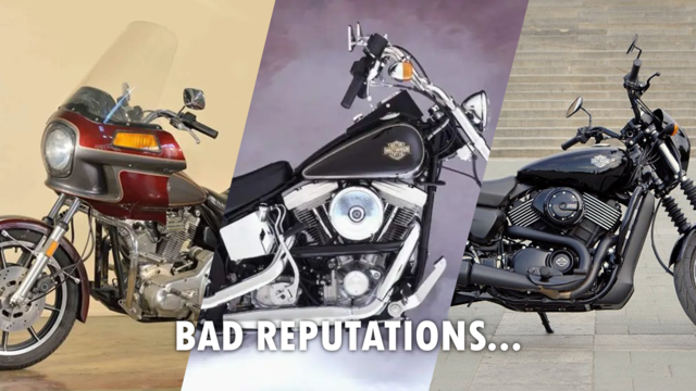
10 Worst Harley-Davidson Motorcycles Ever
Pouria Savadkouei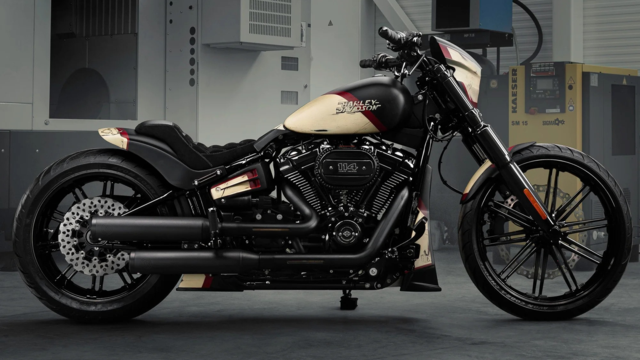
Killer Custom's Jail Break Is The Breakout That Refused to Blend In
Verdad Gallardo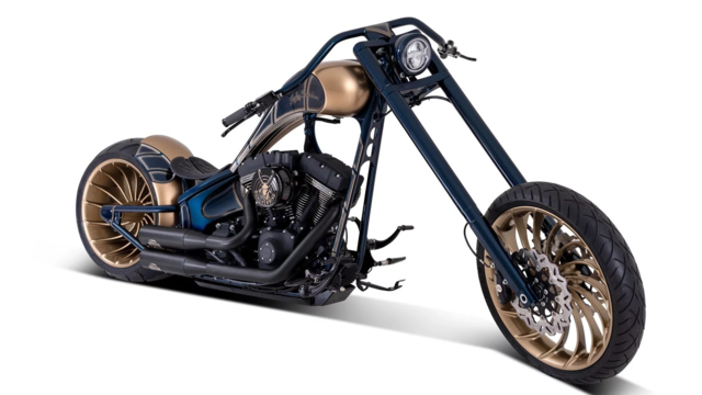
Crazy Bunderbike Build Looks Amazing, But Is It Impossible to Ride?
Verdad Gallardo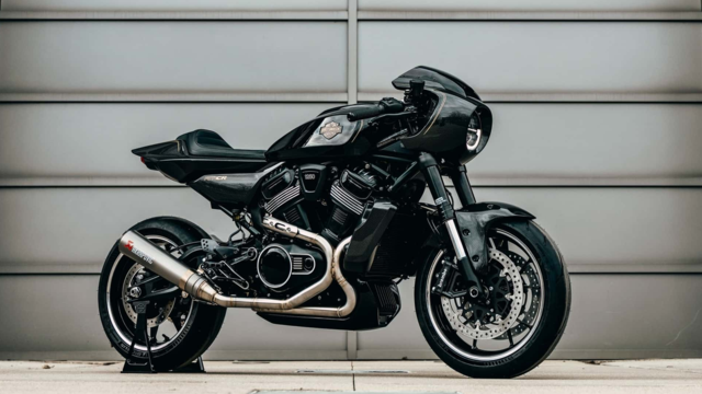
Harley-Davidson Reveals Super Cool Cafe Racer Concept
Verdad Gallardo
Engraved Rebellion: Inside Bundnerbike's Glam Rock II
Verdad Gallardo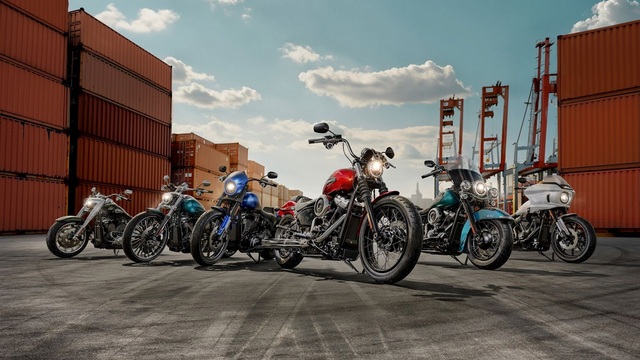
10 Motorcycles You Should Never Buy
Joe Kucinski
10 Things Harley-Davidson Needs to Fix in 2026
Verdad Gallardo
Thread
Thread Starter
Forum
Replies
Last Post